
You’re probably familiar with the adage, “a picture is worth a thousand words.” Cliché as it may sound, it especially rings true when designing visuals to convey complex research problems or social issues. Think of something like a political cartoon, and how powerful and memorable they can be.
That’s exactly what our Hub Solutions design team was tasked to do when Valerie Tarasuk, a food insecurity researcher with PROOF, contracted us to design a graphic illustrating the incredible disconnect between food insecurity and food bank use in Canada.
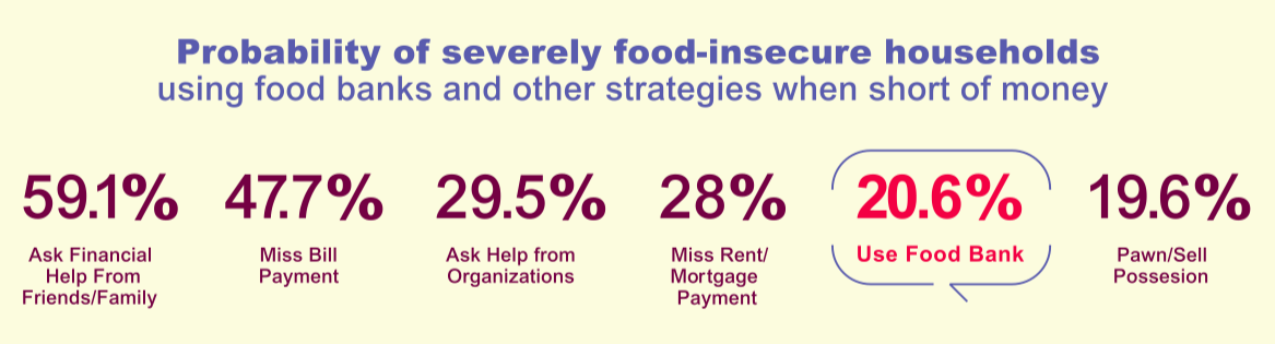
Before we began the design work itself, we needed to do some research. And PROOF’s findings on the topic are clear: there is no evidence that food banks are a solution to the very serious problem of food insecurity in Canada. In fact, PROOF’s research found that “food banks were one of the least common strategies used by severely food-insecure households when they were short of money. Households were more likely to miss a rent or bill payment, or ask family for financial support, than to use a food bank.”
Equipped with this information, and through further conversations with Valerie, we began working with the concept of food banks as a band-aid solution to food insecurity. Our designer set out to sketch the “food bank” band-aid in various scenarios:
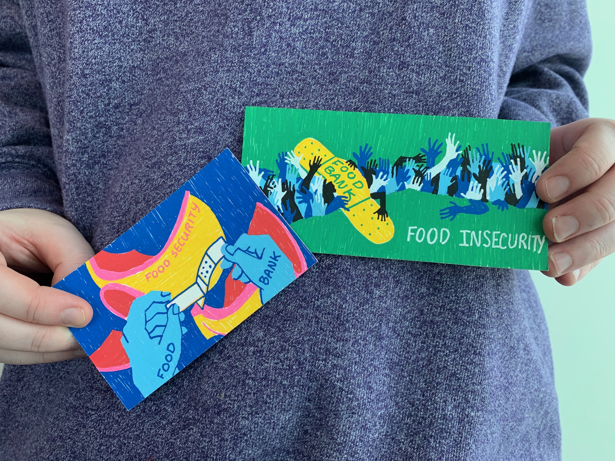
In sharing the resulting sketches with Valerie and her team, we identified some points that would take us back to the drawing board. Valerie’s team felt the mug image didn’t convey the urgency or scale of the problem, and while the bridge image was more or less in the right direction, it looked more like a scene from a zombie film than a statement on food insecurity. (Yikes!) This feedback took a bit of the wind out of our sails, but we pressed on. After all, they’re the content experts in this scenario.
So we recalled PROOF’s research once more, which emphasized that despite widespread recognition that food insecurity is first and foremost an income problem, policy responses in Canada have focused on food provision, with an emphasis on strengthening the charitable food sector. Valerie noted that she often used the phrase ‘drop in a bucket’ to express the impact of food charity when describing the scale of the problem.
The scale of the problem was what we needed to convey, so we designed a new graphic depicting just that.
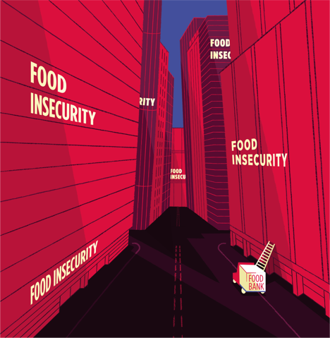
Why does this image work? It makes clear that the current solution to food insecurity, and the reliance on this charitable model, is not reaching the many people experiencing food insecurity. The problem of food insecurity needs to be matched with a much bigger solution.
--
What’s most clear from this case study is that design must always be a collaborative process. Our job as designers and communicators is to ensure the designs we produce accurately reflect the research. While telling the story, we must not lose sight of the fact that the visuals are not simply designed to look ‘pretty’. Without the research team’s input, we risked releasing a visual that didn’t hit as hard as we would have liked… and worse, potentially pushing the conversation about solutions to food insecurity in the wrong direction.
Only time will tell the impact this visual will have on propelling this important research on the problem of food insecurity in Canada towards new policy directions resulting in sustainable solutions, but as with all products designed by Hub Solutions, this visual was not produced to stand alone. It’s accompanied by PROOF’s extensive research on the topic: from academic journal articles to research summaries and social media content. Our hope is that this graphic urges viewers to engage with PROOF’s research to learn the true causes of and solutions to food insecurity in Canada.
Hub Solutions is a social enterprise embedded within the Canadian Observatory on Homelessness (COH). Income generated from Hub Solutions fee-for-service work is reinvested into the COH to support research, innovation, policy recommendations and knowledge mobilization. Learn more: www.hubsolutions.ca